UX/UI Design • User Research • Web Design
Utah State University
School of Graduate Studies
Redesigning the Utah State University School of Graduate Studies website for improved user experience and navigation through user research, strategic focus, and modern design principles.
Graduate students interviewed
Increase in site engagement
Project timeline
Stakeholder satisfaction
Project at a Glance
Clarifying the Audience. Elevating the Experience
Too broad to be effective
The site originally tried to serve both current and prospective students, but lacked clarity, focus, and engagement.
Research revealed the true audience
Interviews and usability tests showed current students didn't use the site; prospective students were the ones who needed it most.
Designed for real needs
We shifted the entire strategy to focus on prospective students: streamlining navigation, improving clarity, and showcasing the value of USU.
Clearer, cleaner, and more impactful
The result: more focused content, a 16% increase in engagement on key pages, and a site the marketing team now proudly uses at recruiting events.

My Role
I served as the lead designer on this project. My contributions included:
Working closely with the Grad School marketing team to understand their goals and identify pain points
Conducting user research and usability testing to validate design decisions
Creating designs in Figma and handling the majority of site implementation in Modern Campus
Managing our team of student developers, coordinating tasks to meet the project timeline
Discovery
Before we touched a line of code, I spoke with nearly 50 current grad students to understand how they used (or didn't use) the site.
The Surprise Finding?
Almost no current students used the grad school site after they enrolled.
This is because any information they needed about their degree was found on their individual college or program websites, rather than the School of Graduate Studies site.
We also ran targeted usability tests with 10 students trying to find key information. We found:
Confusing Terminology
Acronyms like "GPC" were being used throughout the site, confusing many users.
Ambiguous Navigation
Navigation was structured around audience types (e.g. "Future Students", "Faculty"), which didn't reflect user goals.
Uninspiring Design
The site lacked any visual or emotional appeal to prospective students.
Before
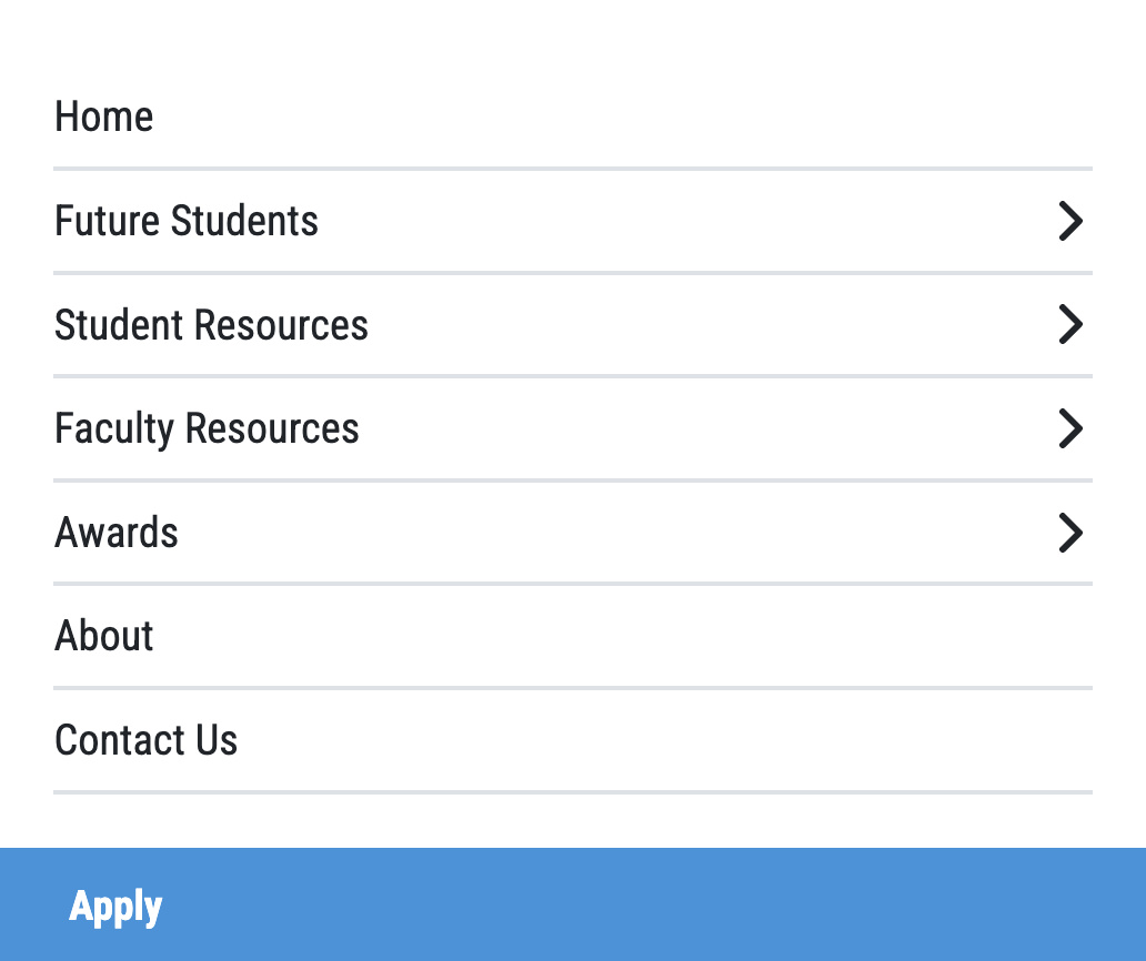
Navigation Before
Organized around audience types, which didn't match how users approached their tasks and added unnecessary complexity.
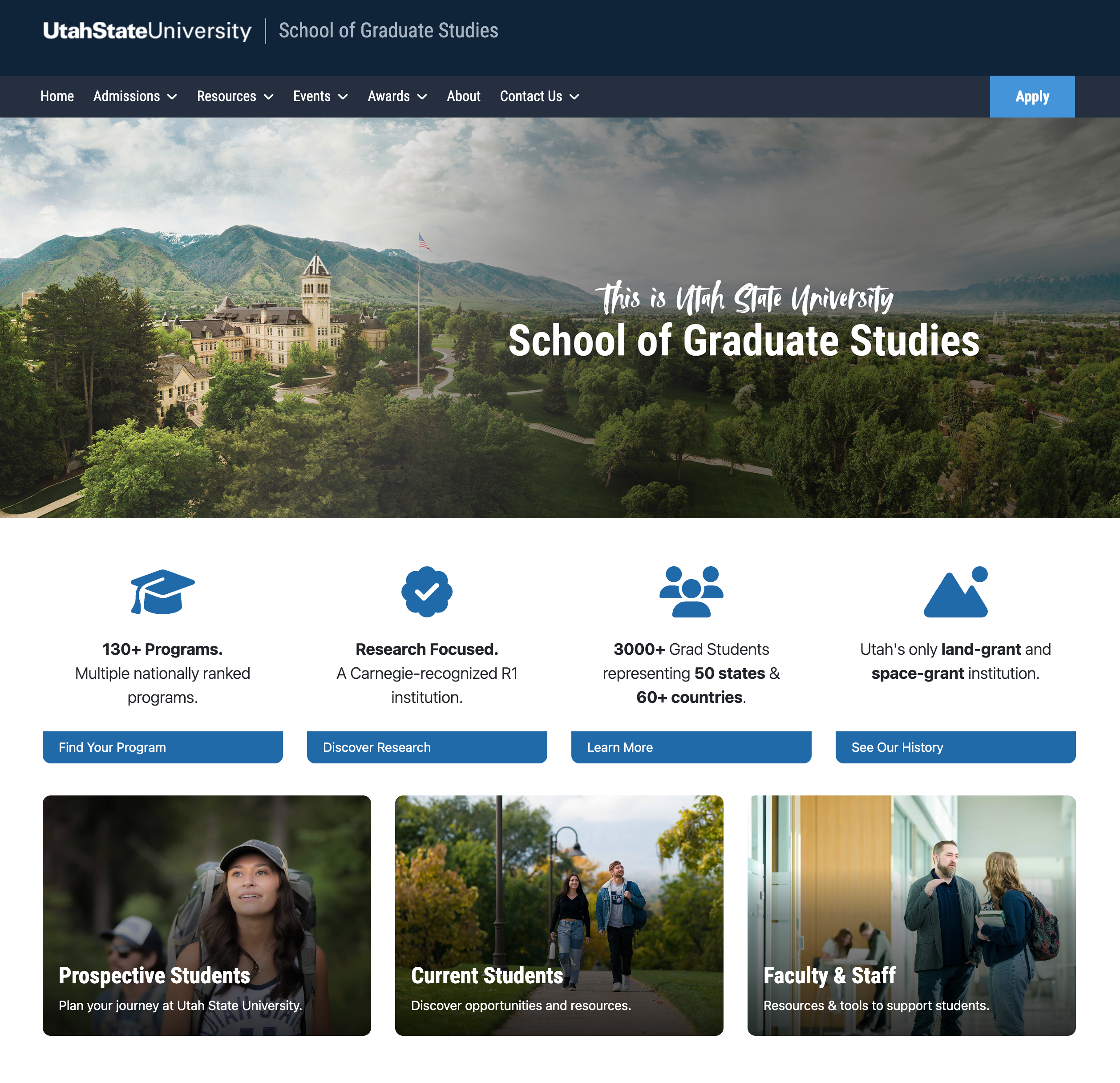
After
Navigation After
Refocused and task-based, helping prospective students find what they need faster and with more clarity.

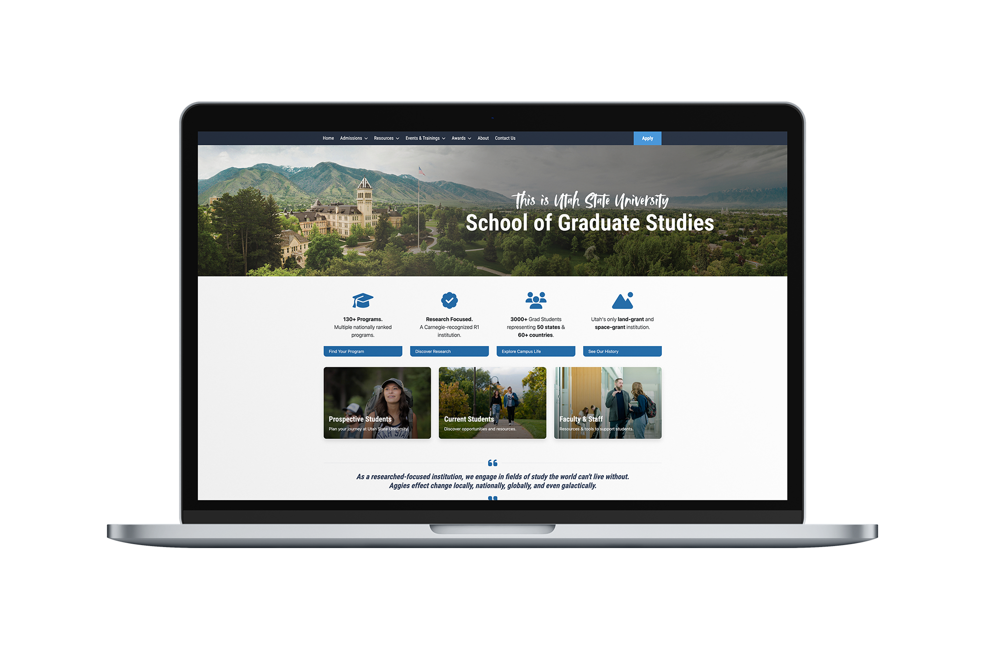
Bringing the Homepage to Life
The old homepage was flat and forgettable, so we reimagined it with prospective students in mind. We introduced interactive image cards in place of plain buttons to create a more engaging experience, built highlight cards showcasing key stats about USU to establish credibility, and incorporated aerial campus photography to evoke a sense of place and pride. These visual and structural updates brought energy to the site and helped tell a clear, more compelling story about what makes graduate study at USU unique.
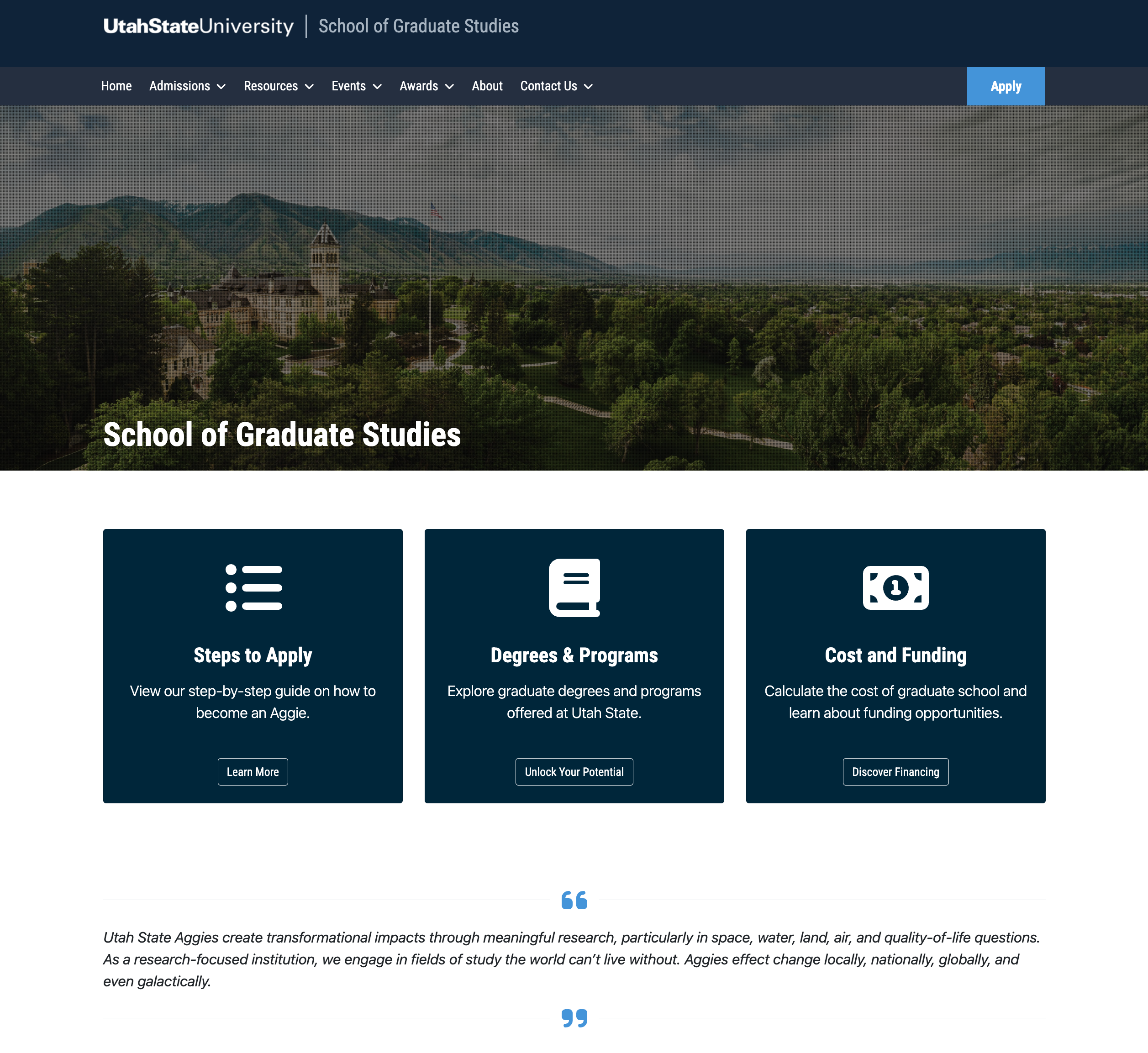
Before
Original Homepage
Bland design with unclear audience and confusing navigation
After
Redesigned Homepage
Focused, engaging design tailored for prospective students
Results
After the launch of the redesigned site, stakeholder and user feedback indicated a strong positive reception.
We saw increased engagement from prospective students, including a 16% average increase in page views on content tailored to them
Students described the new site as "welcoming," "fun," and "full of Aggie pride"
Marketing began using the site much more actively at recruiting events
But the Biggest Win?
We helped the School of Graduate Studies shift focus to where it mattered most: connecting with future students, not duplicating content for current ones. With a clearer purpose and more focused audience, the marketing team now has a streamlined, targeted website they can confidently build on, rather than wasting time maintaining underused pages and fragmented information.