Utah State University
Building Full Web Support
I turned a chaotic, inaccessible network of university websites into a fast, centralized UX delivery system serving 50+ sites and 600+ requests per month.
50+
websites supported
600+
requests per month
<40min
average turnaround
<0.1
accessibility issues per page
Role: Web UX/UI Project Manager
Timeline: 4 years and ongoing
Scope: 50+ websites across 7 major divisions
Overview
Utah State University runs dozens of public-facing websites used by students, parents, faculty, and staff. For years, those sites were technically available but practically broken. Content was outdated, pages were inaccessible, and design quality varied wildly depending on who happened to be editing the site that month.
Departments were given access to a powerful CMS, but most editors were not designers or web professionals. Even with training and new features, the result was the same: important information was hard to find, visual design was inconsistent, accessibility was often ignored. From a user perspective, many of these sites were simply not trustworthy.
To solve this, our central IT web team launched a new model called Full Web Support. Instead of training hundreds of non-technical editors, we centralized implementation in a small, specialized team that could deliver fast, consistent, and high-quality results.
I was the first manager hired to lead this new model.
The Problem
Decentralized Chaos
Before Full Web Support, every department managed its own website inside our CMS. In theory this created flexibility; in practice it created chaos.
We constantly ran into pages that were inaccessible, visually broken, or so disorganized that even our own team would say “what on earth happened here?” Content was often out of date. Navigation made little sense. Design varied wildly from one unit to another.
We kept trying to fix this by adding features and offering more training. But we eventually realized something important: good websites don't come from better tools. They come from people with design judgment, accessibility knowledge, and an understanding of best practices.

The Key Insight
Training everyone to be a web expert was the wrong goal. What departments actually needed was not a tool. They needed a service.
If we centralized implementation in a team that understood UX, accessibility, and design systems, we could save time for everyone and dramatically improve the quality of the product.
That was the idea behind Full Web Support.
What I Designed
A Complete Service Model
A New Intake and Communication System
I designed how work would enter the system and how units would interact with us. Each supported unit has:
- A dedicated email address that automatically creates tickets in ClickUp
- A private Slack channel for fast, human communication
- A public website and form explaining how to work with us
This removed ambiguity about how to get help and eliminated long email chains.
A Delivery System for a Student-Run Team
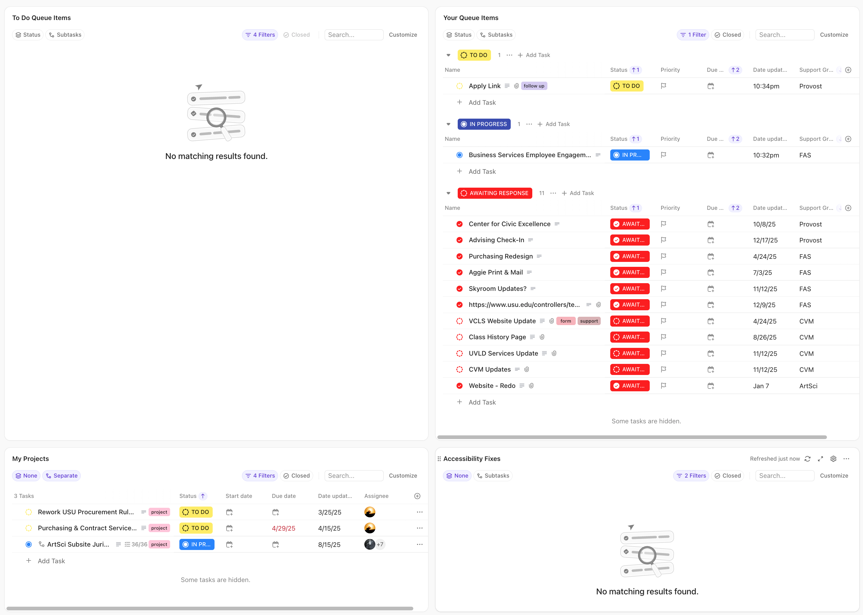
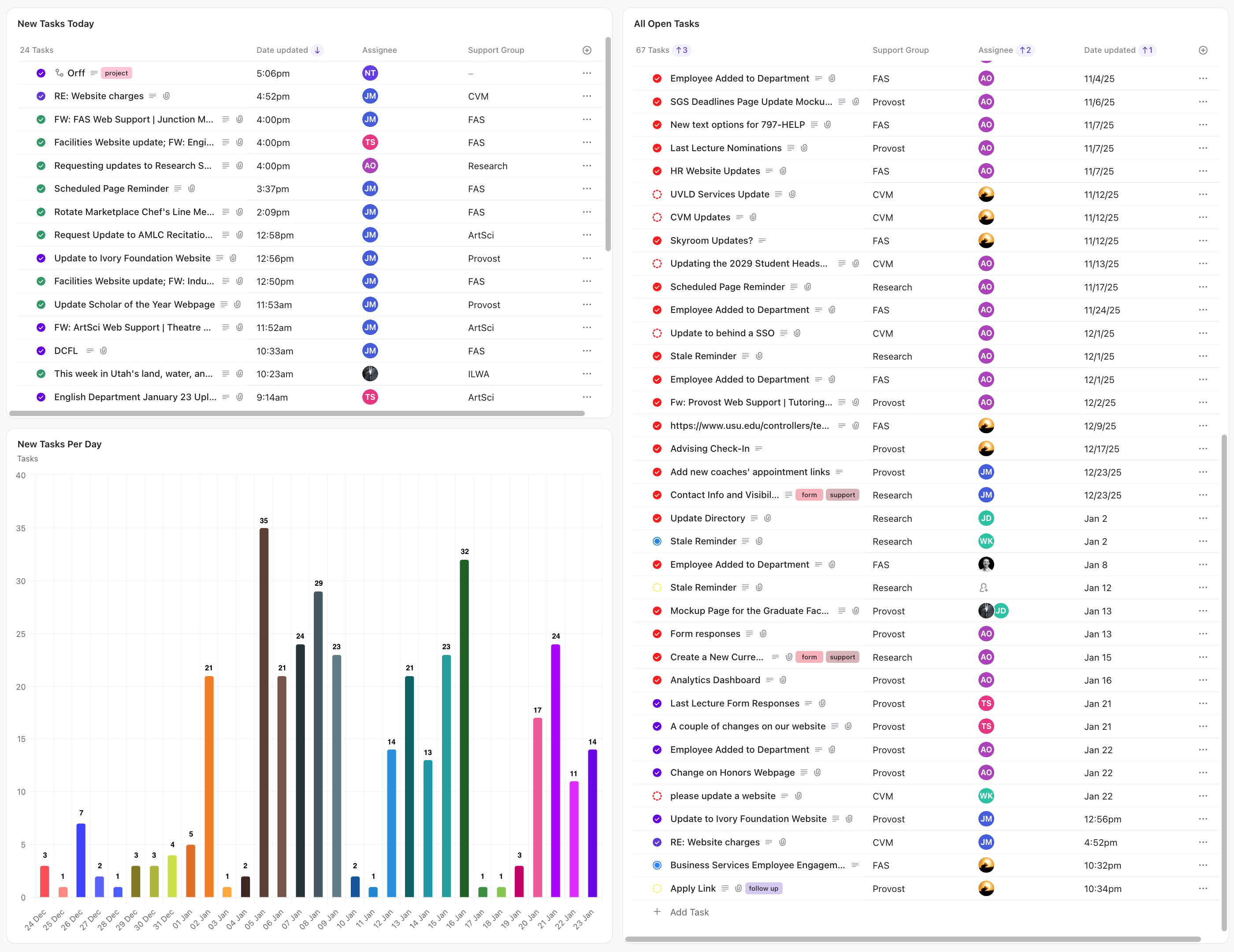
We process over 600 requests per month using 5-6 student developers. That only works if the system is designed well.
I built and continuously refined our ClickUp workflows to:
- Track incoming requests
- Separate quick edits from larger projects
- Assign work clearly
- Capture data on how much effort each unit requires
This allowed us to hit our service goal of extremely fast turnaround times while still maintaining quality.
Design, Accessibility, and Brand Governance
Centralization gave us something we never had before: control.
Because only trained staff could touch the code, I was able to:
- Design and introduce new elements to improve visual quality
- Enforce brand standards consistently
- Enforce accessibility standards across all sites
- Add CMS features like page notes to prevent mistakes on sensitive pages
I also review nearly everything that goes out, provide design feedback to student developers, and run accessibility and quality checks before content goes live.
Ongoing UX Ownership
This model is not just reactive. I meet with every supported unit at least once per semester to:
- Review their site
- Identify UX and content issues
- Recommend improvements
- Plan upcoming work
For larger units, I also conduct user research to better understand their audiences and shape how their sites are structured.
The Risk
This model only works if we keep up with demand and maintain quality.
When we launched with our first partner, the Office of Research, the risk was simple: if we got overwhelmed or delivered poor work, they would leave. If they left, we would never be able to convince other units to join.
Our entire growth model depended on visible success.
What Happened
It Worked
Because of the systems I put in place, most requests are now completed in under 40 minutes. Accessibility issues dropped from roughly six per page to basically zero. Design and brand consistency improved across more than 50 sites.
Just as important, departments stopped dreading their websites and postponing projects. They started asking for improvements instead of avoiding the platform.
50+
websites
7
major divisions
600+
monthly requests
6 → 0.1
issues per page
A Concrete Win
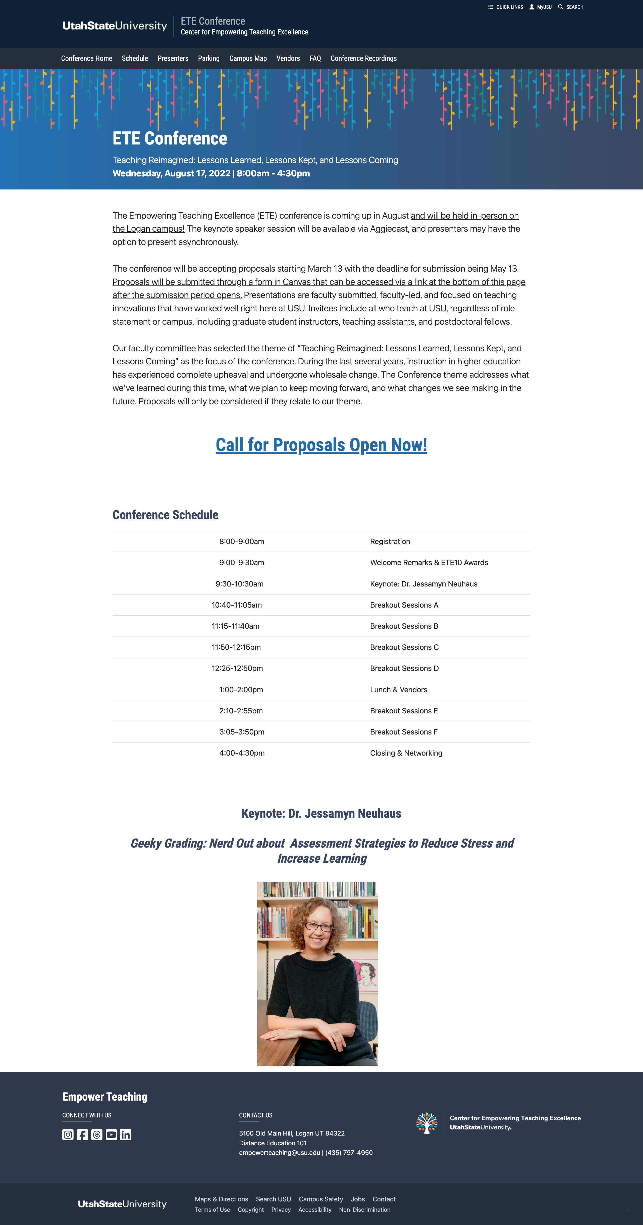
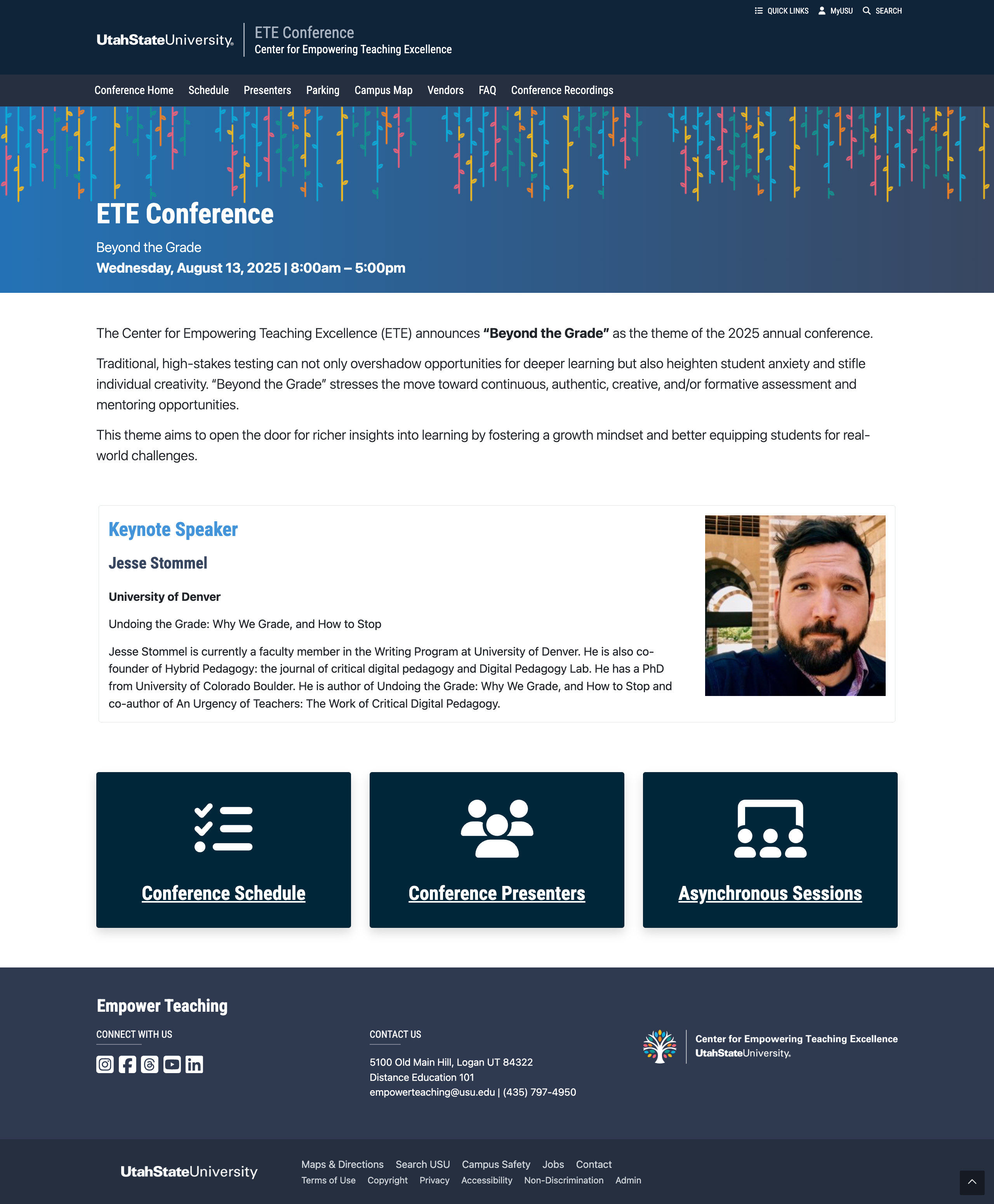
One of our most skeptical partners was the Center for Empowering Teaching Excellence. They were hesitant to give up edit access and were worried about losing control. I asked them to try it for a month.
During that time, I reorganized and redesigned their site so content was easier to find and easier to maintain. Then we tackled their biggest annual project.
Each summer they run a large conference that requires a full website with schedules, sessions, presenters, and logistics. In the past, this took them months of work.
I met with their team, created a plan for how they would deliver content, and our team built the entire site in less than a week.
That project changed everything. They went from skeptics to some of our strongest advocates.
Before
After
Impact
Today, Full Web Support manages more than 50 websites across seven major divisions, processing over 600 requests per month with a small, highly trained team.
Because the work is centralized:
- Sites are accessible
- Designs are consistent
- Content stays up to date
- Custom features are safe to build
- Departments save enormous amounts of time
Most importantly, students, faculty, and staff get better, more trustworthy digital experiences.
What I Learned
This project taught me that UX at scale is often about systems, not screens.
By designing how work flows, who touches it, and how quality is enforced, I was able to turn a chaotic, decentralized model into something reliable, fast, and genuinely user-focused.
That's the kind of work I want to keep doing.