Utah State University
School of Graduate Studies Website Redesign
Graduate Studies leadership and marketing knew their website was not working, but they did not know where to focus. The site had grown through years of edits by many people, leaving it inconsistent, cluttered, and hard to use as a marketing tool. The goal was to quickly bring clarity, align stakeholders, and ship a site that could actually support recruitment.
50+
graduate students interviewed
16%
increase in site engagement
~5 weeks
project timeline
100%
stakeholder satisfaction
Role: UX, Information Architecture, Design Systems, Frontend
Timeline: ~5 weeks (early July to mid August)
Scope: School of Graduate Studies website
The Problem
The site was trying to serve everyone: prospective students, current students, faculty, and staff. In practice, that meant it served no one particularly well.
Marketing could not confidently send people to the site, and leadership felt the experience did not reflect the quality of the programs.
Through stakeholder interviews, content review, and light user research, it became clear that the site's primary job was to support prospective students. That insight became the foundation for every decision that followed.

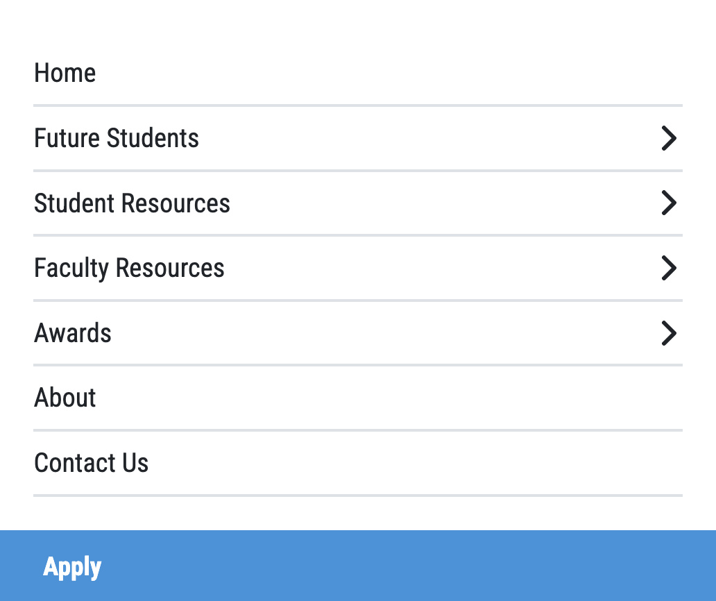
What Was Broken
Years of Unfocused Growth
- The site had sprawling, duplicated content created by many independent editors
- Navigation was unfocused and reflected internal structure instead of user goals
- Visual design was bland and inconsistent
- The site did not feel like a modern marketing experience
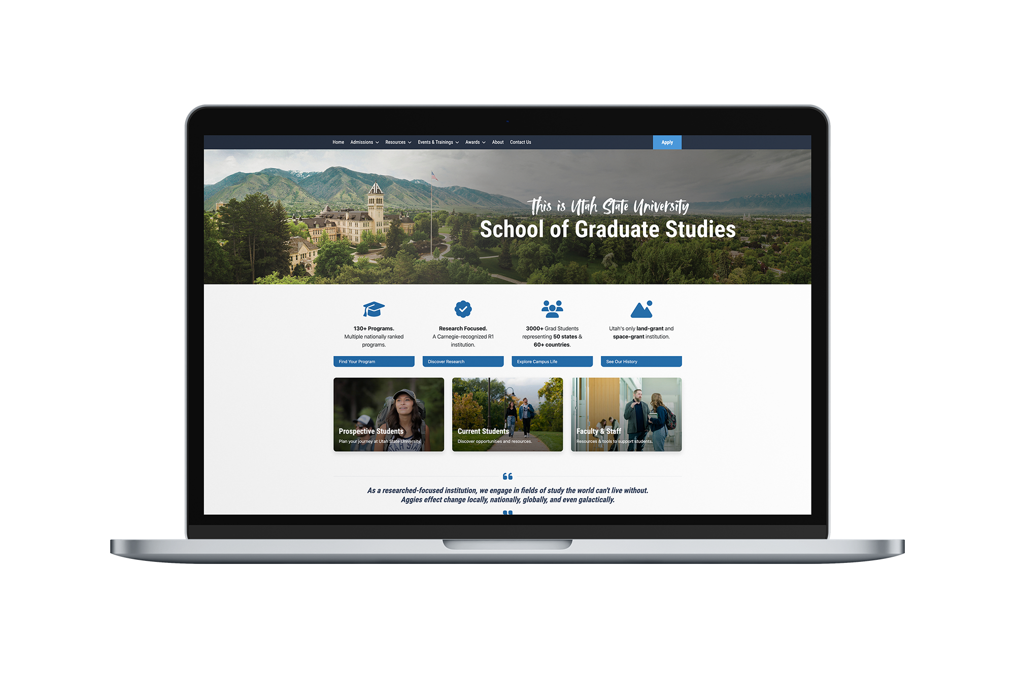
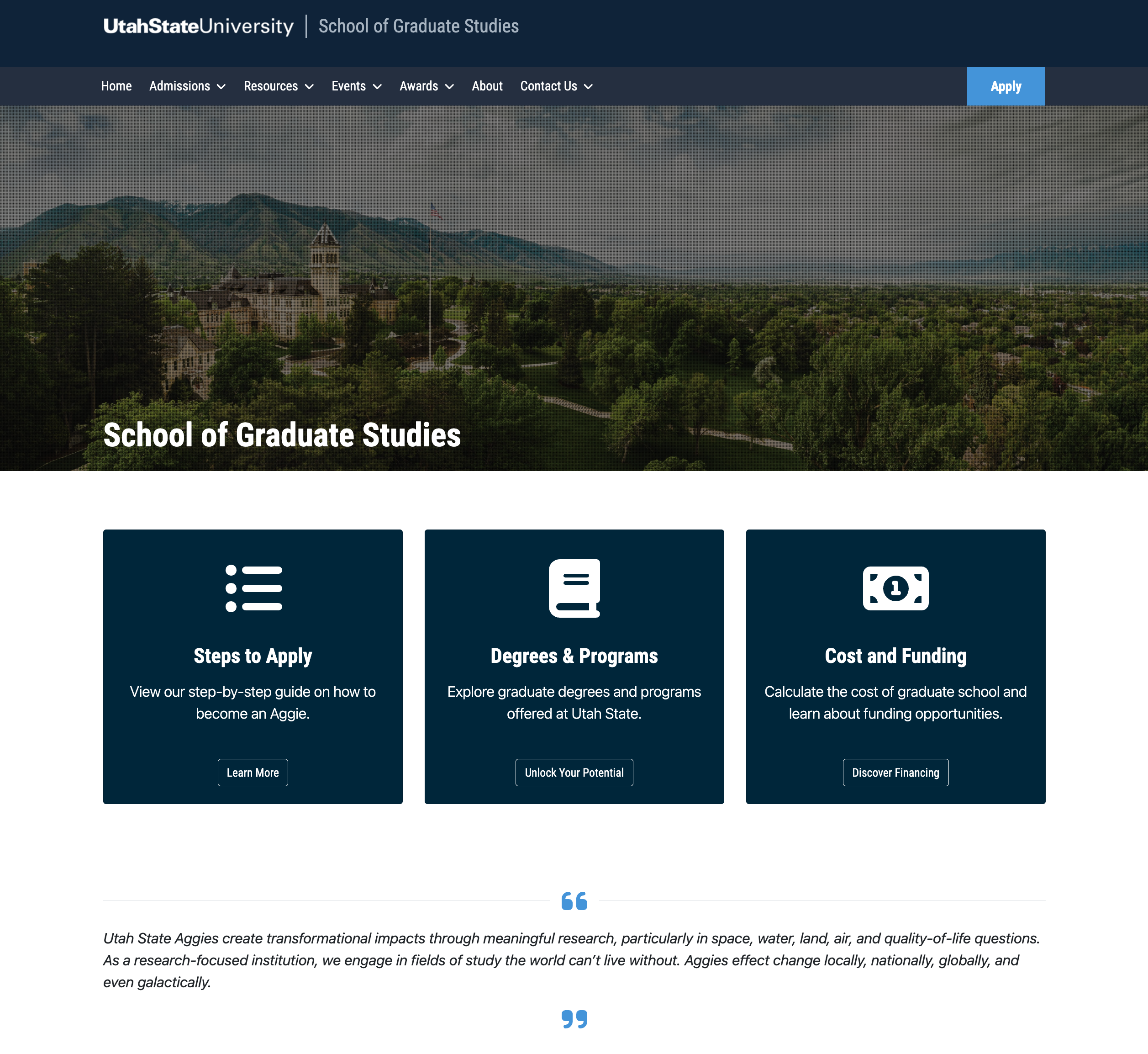
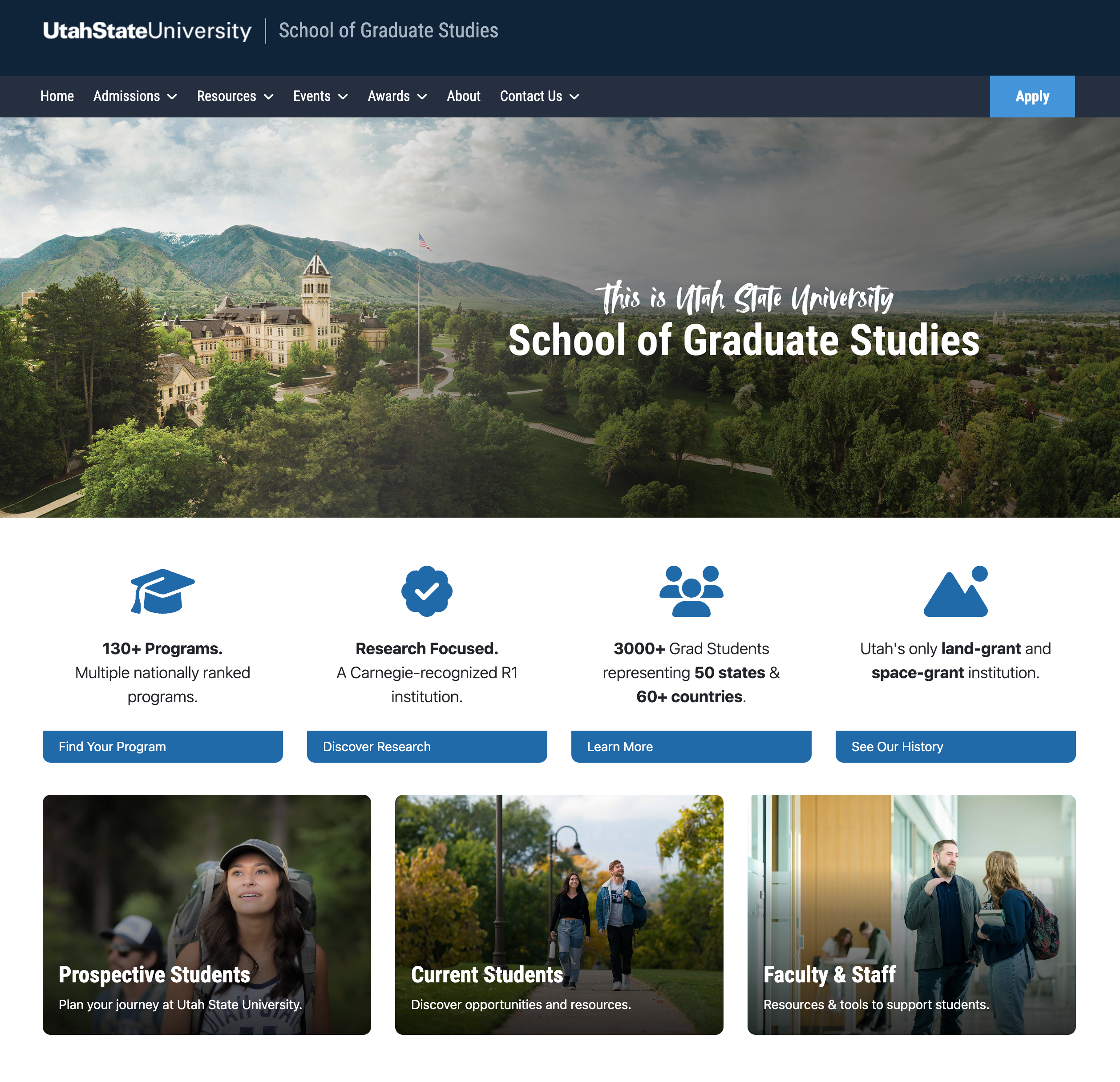
Before
After
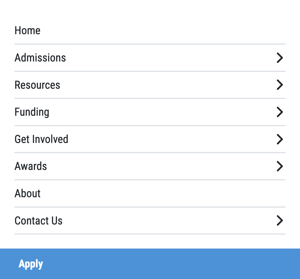
The Insight
The site's primary job was to support prospective students. That insight became the foundation for every decision that followed.
Once we confirmed that prospective students were the real audience, we simplified everything around that.
- Prioritizing recruitment and program discovery over internal information
- Removing or consolidating pages that did not support that goal
- Creating clearer paths to key actions
- Giving marketing a homepage and templates that could actually support campaigns
This shift allowed stakeholders to let go of pet pages and focus on what mattered.
What I Did
Bridging Marketing, Leadership, and the Web Platform
I acted as the bridge between marketing, leadership, and the web platform. My responsibilities included:
- Meeting with stakeholders to understand goals and pain points
- Auditing the existing site structure and content
- Restructuring navigation around prospective student needs
- Designing and building new components and visual elements
- Implementing changes in the CMS using custom CSS
- Ensuring accessibility and responsive behavior
This was not a one-off page redesign. It was a system-level cleanup that had to work within a shared university design system and be maintainable long-term.
Design & Build
Reusable Components Over One-Off Pages
Rather than creating one-off pages, I focused on reusable components that could be applied across the site.
- Structured hero and callout patterns for marketing content
- Modular content blocks for programs and requirements
- Visual treatments that added personality while staying on brand
I implemented these directly in the CMS with custom CSS and accessibility best practices.
Before
After
Results
Alignment Was the Biggest Win
After launch:
- Stakeholders were highly satisfied with the outcome
- Marketing was able to focus on what mattered instead of fighting the site
- Large sections of unnecessary content were removed or consolidated
- The site became a clearer, more confident recruitment tool
The project also helped establish patterns that were reused on other university sites.
Constraints
We had about five weeks to go from kickoff to launch. That meant research, alignment, design, and implementation had to happen in parallel.
Stakeholder alignment was the biggest challenge, and user research became the neutral ground that allowed decisions to move forward.
Reflection
This project shows how I work when time and data are limited. I rely on structured audits, stakeholder insight, and directional research to impose clarity and ship something real.
If I were running this again, I would add deeper post-launch analytics to quantify conversion and engagement more precisely.
The real outcome was not just a new design, but a shared understanding of what this site is for and how it should support the university's goals.